How to create a widget for streams with remote control
In this article, we’ll go step by step to create a stream widget with remote control. You can follow along and end up with a working widget.
Preparation
All widgets are regular websites that run in the built-in browser of OBS Studio. Therefore, to create a widget you’ll need a standard web-development toolset.
To keep things simple, we won’t use any web frameworks and will implement everything with plain HTML, CSS, and JavaScript. However, we’ll still use Vite (a tool that simplifies development and bundling for publication).
BunJS
Install BunJS — a modern package manager and JavaScript runtime. You can find installation instructions on the official website.
powershell -c "irm bun.sh/install.ps1 | iex"curl -fsSL https://bun.sh/install | bashVisual Studio Code
You’ll also need VSCode — the code editor we’ll use for development. Download it from the official website.
Project creation
Create a new folder for your project and open it in VSCode. Then open the terminal in VSCode (Terminal → New Terminal) and run:
bun create vite . --template vanillaPress Enter a few times to accept the defaults.
Terminal output after running the command
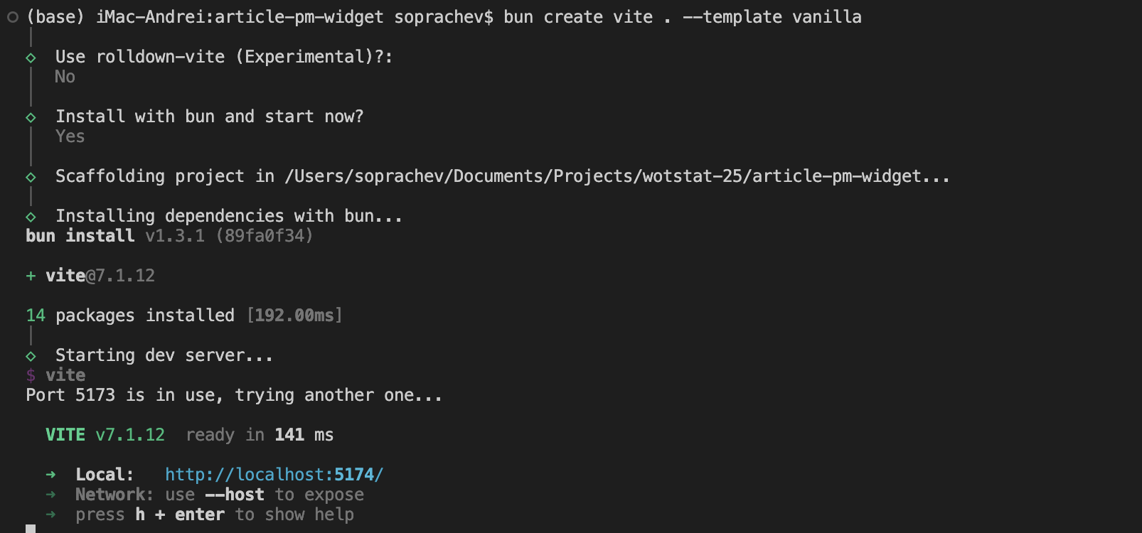
Your project will be set up, dependencies installed, and a local development server started (usually at http://localhost:5174/).
Open that address in your browser—you should see the Hello Vite! starter page.
Clean up the starter page: in VSCode, delete the public folder and the files src/counter.js and src/javascript.svg.
Edit the src/main.js file, removing everything except the stylesheet import:
import './style.css'Also completely clear the src/style.css file, leaving it empty.
Done! Thanks to Vite, every change in your files will be automatically reflected in the browser. You should now see a blank white page.
Creating the widget
Development will consist of two stages:
- Create the widget’s visual design
- Add remote-control functionality
Visual design of the widget
The widget’s design is completely up to you and depends on your task; the process is no different from building a regular website. In this article, we’ll create a simple LBZ (Personal Missions) counter. It consists of three blocks, each with a progress bar and the number of completed LBZ.
The only difference from a regular website is the widget’s dimensions. We’ll make it automatically fit the screen width so the streamer can use it at any resolution. To do this, we’ll set the font size to 1% of the viewport width and specify all sizes in em.
:root {
  /* Transparent background */
  color-scheme: dark;
  background: transparent;
}

body {
  /* Set font size based on window width */
  font-size: 1vw;

  /* Remove margin and hide scrollbars */
  margin: 0;
  overflow: hidden;
}
Now create the general structure of the widget in index.html:
...
<div id="app">
  <div class="item item-1">
    <header>
      <h2>VI - VII уровень</h2>
      <p><span class="current">18</span> / 25</p>
      <img src="./src/assets/complete.png">
    </header>
    <div class="progress-bar">
      <div class="progress-bar-background"></div>
      <div class="progress-bar-pattern"></div>
      <div class="progress-bar-blink"></div>
    </div>
  </div>
</div>
...
Duplicate the div.item block twice, change the h2 heading text, and add the completed class to the last div.item.
We’ll need some assets from the game, which you can find in the gui.pkg package or in the Kurzdor/wot.assets repository.
- The font can be found at
gui/gameface/fonts/Warhelios-Regular.ttf - Progress-bar parts at
/gui/maps/icons/components/progress_bar - The checkmark for a completed stage at
/gui/maps/icons/personalMissions3/QuestsView/complete.png
Copy the required assets into the src/assets folder of your project.
Adjust the styles in style.css to achieve the following result:
Full style.css source
:root {
  /* Transparent background */
  color-scheme: dark;
  background: transparent;
}

@font-face {
  font-family: Warhelios;
  src: url(./assets/Warhelios-Regular.ttf) format("truetype");
}

body {
  /* Set font size based on window width */
  font-size: 1vw;

  /* Remove margin and hide scrollbars */
  margin: 0;
  overflow: hidden;

  font-family: Warhelios, sans-serif;
}

#app {
  display: flex;
  gap: 1em;
  padding: 1em;
}

.item {
  border-radius: 1.3em;
  padding: 1.2em;
  border: 0.25em solid rgba(255, 173, 65, 0.4);
  background:
    linear-gradient(0deg, rgba(195, 90, 4, 0.1), rgba(255, 255, 255, 0) 50%),
    radial-gradient(farthest-corner at 50% 200%, rgba(251, 166, 20, 0.4), rgba(218, 139, 1, 0.3) 90%);

  display: flex;
  flex-direction: column;
  flex: 1;

  max-width: 30%;
  box-shadow: 0 0 1em rgba(0, 0, 0, 0.2);
}

.completed {
  border: 0.25em solid rgba(106, 255, 65, 0.3);
  background:
    linear-gradient(0deg, rgba(80, 255, 27, 0.3), rgba(26, 255, 0, 0) 50%),
    radial-gradient(farthest-corner at 50% 200%, rgba(4, 102, 5, 0.4), rgba(13, 114, 0, 0.3) 90%);
}

header {
  font-size: 1em;
  display: flex;
}

header h2 {
  flex: 1;
}

header h2,
header p {
  font-size: 2.7em;
  margin: 0;
  font-weight: normal;
}

.current {
  color: #ffd28f;
}

img {
  width: 9em;
  height: 9em;
  margin: -3em;
  display: none;
}

/* Progress bar */
.progress-bar {
  height: 0.3em;
  width: 100%;
  margin-top: 1em;
  position: relative;
}

/* Background part of the progress bar (gray rectangles) */
.progress-bar-background {
  background-image: url(./assets/pattern_grey.png);
  background-repeat: repeat;
  background-position: 0 50%;
  background-size: 0.4em 1em;

  position: absolute;
  width: 100%;
  height: 100%;
  box-shadow: 0 0 2em rgba(0, 0, 0, 0.5);
}

/* Current progress highlight (glow) */
.progress-bar-blink {
  height: 5em;
  width: 5em;

  background-image: url(./assets//glow_small.png);
  background-size: contain;
  mix-blend-mode: lighten;
  position: absolute;
  transform: translate(-49%, -50%);
  top: 50%;
  left: var(--progress, 60%);
  transition: left 0.2s ease;
}

/* Filled part of the progress bar */
.progress-bar-pattern {
  background-image: url(./assets/pattern_orange.png);
  background-repeat: repeat;
  background-position: 0 50%;
  background-size: 0.4em 1em;

  position: absolute;
  height: 100%;
  width: var(--progress, 60%);
  transition: width 0.2s ease;
}

/* Gradient highlight for the progress bar */
.progress-bar-pattern::after {
  content: "";
  position: absolute;
  right: 0;
  top: 0;
  width: 100%;
  height: 100%;

  background-image: linear-gradient(90deg, rgba(0, 0, 0, 0.6), rgba(255, 206, 122, 0.5));
  mix-blend-mode: overlay;
}

/* Overrides for completed stages */
.completed .progress-bar-pattern {
  background-image: url(./assets/pattern_green.png);
  width: 100%;
}

.completed .progress-bar-pattern::after {
  background-image: linear-gradient(90deg, rgba(0, 0, 0, 0.6), rgba(187, 255, 78, 0.519), rgba(0, 0, 0, 0.6));
}

.completed .progress-bar-blink,
.completed header p {
  display: none;
}

.completed img {
  display: block;
}
Full index.html source
<!doctype html>
<html lang="en">

<head>
  <meta charset="UTF-8" />
  <meta name="viewport" content="width=device-width, initial-scale=1.0" />
  <title>article-pm-widget</title>
</head>

<body>
  <div id="app">
    <div class="item item-1">
      <header>
        <h2>VI - VII tire</h2>
        <p><span class="current">18</span> / 25</p>
        <img src="./src/assets/complete.png">
      </header>
      <div class="progress-bar">
        <div class="progress-bar-background"></div>
        <div class="progress-bar-pattern"></div>
        <div class="progress-bar-blink"></div>
      </div>
    </div>

    <div class="item item-2">
      <header>
        <h2>VII - IX tire</h2>
        <p><span class="current">18</span> / 25</p>
        <img src="./src/assets/complete.png">
      </header>
      <div class="progress-bar">
        <div class="progress-bar-background"></div>
        <div class="progress-bar-pattern"></div>
        <div class="progress-bar-blink"></div>
      </div>
    </div>

    <div class="item item-3 completed">
      <header>
        <h2>X - XI tire</h2>
        <p><span class="current">18</span> / 25</p>
        <img src="./src/assets/complete.png">
      </header>
      <div class="progress-bar">
        <div class="progress-bar-background"></div>
        <div class="progress-bar-pattern"></div>
        <div class="progress-bar-blink"></div>
      </div>
    </div>

    <script type="module" src="/src/main.js"></script>
</body>

</html>
As a result, you’ll get the following widget: 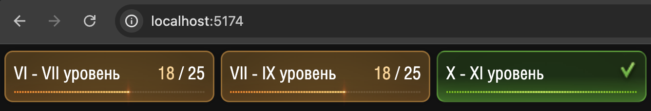
Remote-control functionality
Now let’s add remote control. To do this, install the wotstat-widgets-sdk library and declare the widget’s remote parameters.
Run this command in the terminal:
bun add wotstat-widgets-sdkbun add wotstat-widgets-sdkIn the src/main.js file, import the library and declare the widget parameters:
import './style.css'
import { WidgetsRemote } from 'wotstat-widgets-sdk';

const remote = new WidgetsRemote();

remote.defineState('VI - VII уровень', 0, { elementHelper: '.item-1' });
remote.defineState('VII - IX уровень', 0, { elementHelper: '.item-2' });
remote.defineState('X - XI уровень', 0, { elementHelper: '.item-3' });
Now you can open your link in the widget control panel at ru.widgets.wotstat.info/remote-control and make sure the widget parameters appear in the list; when you hover over a parameter, the corresponding widget block is outlined: 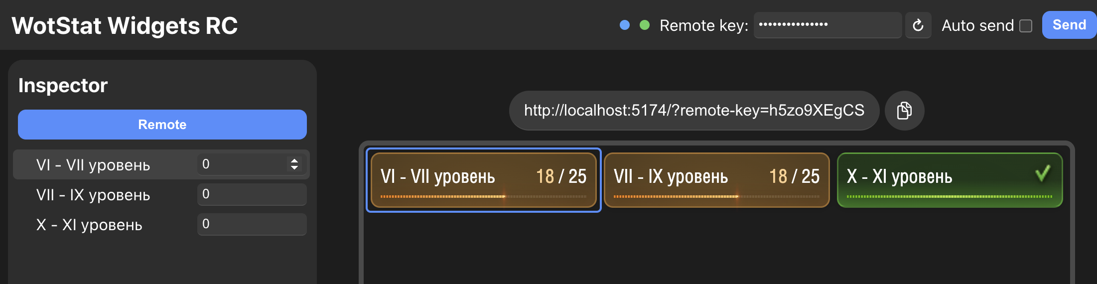
The outline works thanks to the elementHelper property, where we specified the CSS selector of the desired block.
Next, we need to handle parameter changes. Create an updateState function and subscribe to changes for each parameter using the watch method:
...
function updateState(selector, value) {
  const element = document.querySelector(selector);

  // Set the counter value
  element.querySelector('.current').textContent = value;

  // Toggle the completed stage class
  if (value >= 25) element.classList.add('completed');
  else element.classList.remove('completed');

  // Add a CSS variable for the progress bar
  element.style.setProperty('--progress', `${100 * value / 25}%`);
}

remote.defineState('VI - VII уровень', 0, { elementHelper: '.item-1' })
  .watch((v) => updateState('.item-1', v));

remote.defineState('VII - IX уровень', 0, { elementHelper: '.item-2' })
  .watch((v) => updateState('.item-2', v));

remote.defineState('X - XI уровень', 0, { elementHelper: '.item-3' })
  .watch((v) => updateState('.item-3', v));
Done! Now, when the parameters change in the control panel, the widget updates automatically.
Publishing the widget
The final step is to publish the widget so it’s available for use over the internet.
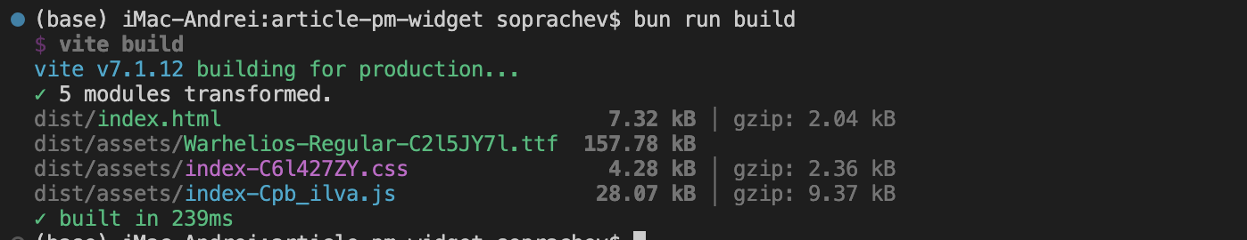
First, build the project. In the terminal, run:
bun run buildbun run buildAs a result, a dist folder will be created containing the site ready for publication.
You can host this site on any static hosting, for example:
- wasmer.io — free after registration (you can sign in with Google)
- Yandex Cloud in S3 hosting mode — free, but registration is complicated
- GitHub Pages — free, but requires registration and creating a repository on GitHub
Adding to OBS
After publishing, paste the widget link into the remote control panel, generate an access key, and add the widget to OBS Studio as a Browser Source, specifying the generated link.
Don’t forget to choose
Blending Method→SRGB off. You can study this in more detail in the guide.
Source code
All widget source code is available in the repository on GitHub. The result is published on GitHub Pages at: soprachevak.github.io/mt-pm3-progress-widget and in the control panel at ru.widgets.wotstat.info/remote-control
 Andrei Soprachev